Blue Bear Cafe
A brand identity and packaging concept for a neighbourhood café.

Services:
Strategy, Identity, Packaging, Art Direction
Industry:
Hospitality & Coffee
Timeline
4 Weeks
The Challenge
Blue Bear sits on a leafy corner in the middle of inner-city Brisbane, in a neighbourhood with a café every hundred meters. It’s run by a couple who know regulars by name, and a dog loved by everyone. The coffee is great, the bakery is fantastic, and the staff are the kind of friendly that makes you stay for a second cup.
Most of the street has recently rebranded, and they’ve all gone the same way: sleek, elegant, beige, trendy. It’s starting to blur together. Everyone has chased “minimal,” and in doing so they’ve lost the one thing a neighbourhood café actually sells, which is how it makes you feel.
Blue Bear never lost that. It has plenty of personality, and the opportunity was to build an identity that carries it from inside the door onto everything outside it. The existing bear had real heart, and I wanted to keep that. The goal was a version that reads at any size and leans into the warmth the café is known for.
The people walking past are yoga mums on the way home from class, young professionals grabbing something before work, and locals looking for their place. They have a dozen options within a short walk. The real challenge was making people feel the café before they’d ever walked in, so they choose it over the sleek place next door.
This was a self-initiated project. I loved the name, the people and the feeling of the place, and I wanted to explore where the brand could go next.
The Hard Part
Standing out without going trendy. The easy move was to follow the street into sleek minimalism, but then Blue Bear would just blend in. I pushed toward character instead, with enough restraint that it feels considered, not childish.
Warm without a grin. The bear has open eyes and no mouth, on purpose. A big smile would have made it a cartoon. Instead it shows how it feels through its eyes and body, with heart eyes over a donut or eyes closed as it breathes in a fresh pour-over. No mouth also means customers bring their own mood to it, and calm was what I wanted most.
A mascot that does a job. One bear on a cup is a logo. A bear who carries a tray, pours a filter and sneaks a donut is a staff member. Each pose fits a moment in someone’s day, so the bear always has something to do.
Built for things nobody planned. Café brands end up on chalkboards, takeaway bags, staff shirts and the sign taped to the door when the coffee machine breaks. So everything is one colour and line-drawn, and works at any size. The icon set (salmon, cups, portafilter, iced coffee, pour-over) means there’s always something on-brand to grab.




The Result
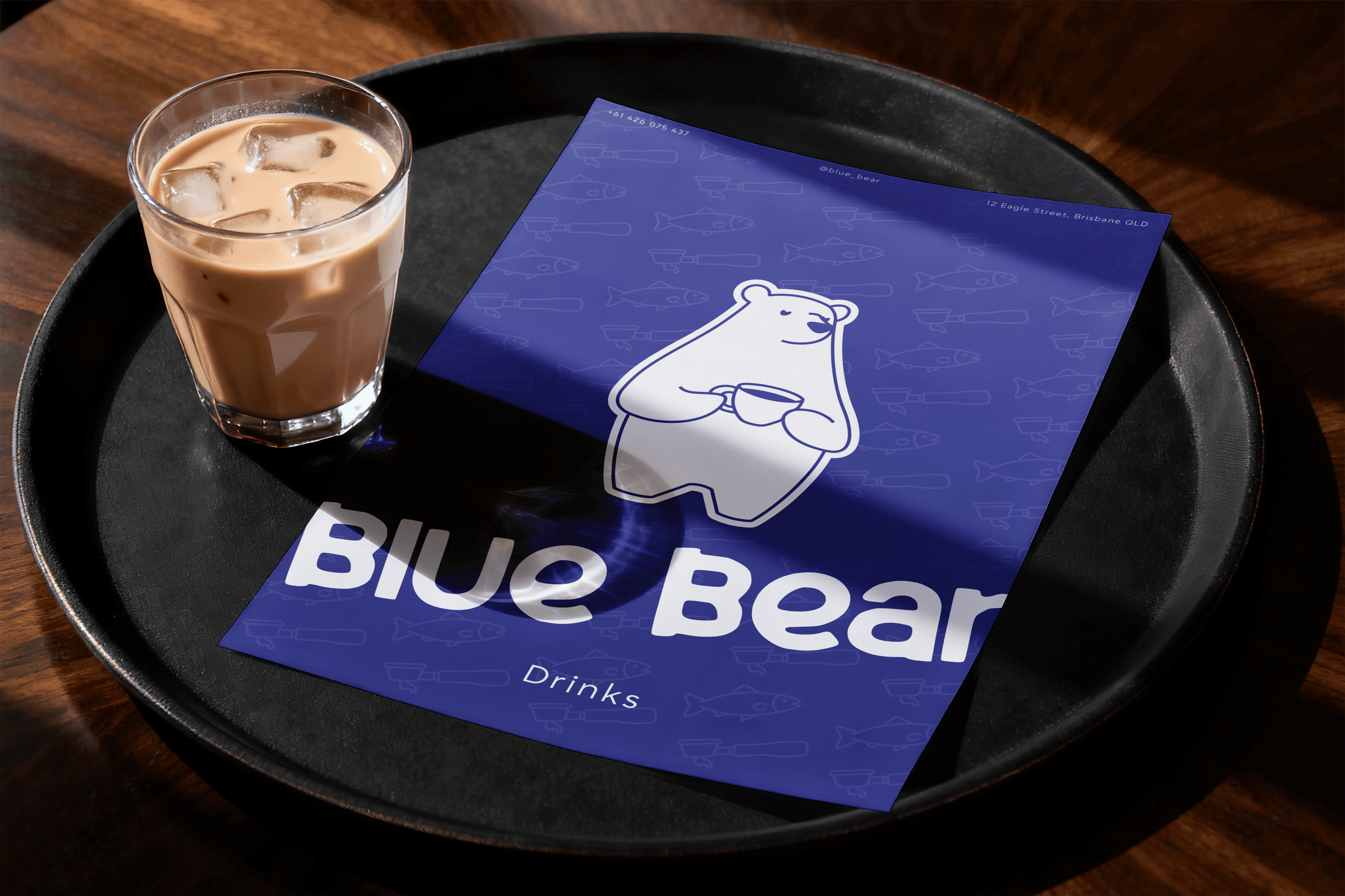
The bear is the host now, he’s big, soft and gentle. Around him there’s a full system, with a set of poses, an icon library, a hand-drawn wordmark and one confident blue nobody else on the street is using. In a neighbourhood full of black and beige, you can spot Blue Bear from across the road.
Bears catch fish, so on the loyalty card, you do too. Collect eight salmon and your next coffee’s on the house.
The voice sounds like the people behind the counter. The menu promises a Piccolo with “small cup, big personality” and tells you to order the matcha “at your own risk.” The loyalty card says “You come here a lot. We noticed.” The cup just hopes it makes your morning a bit better. None of it is selling. It talks to you like a regular, even on your first visit.
I also pushed the brand past what the café has today. A retail coffee range, with the Honey Badger house blend and single origins like Red Valley, shows how it could grow from a corner café into something people take home. The bear pours the filter on the bag, just like he does on the menu.
The street is full of cafés that look good. Blue Bear is the one that feels good.
Self-initiated concept. The café has been renamed.


